The Evolution of Netflix: More Than Just a Streaming Service

Written By:
Joseph
Joseph is the CEO of The Uptown Agency and has expertise across industries and disciplines including branding, marketing, and venture capital. He has worked with hundreds of top brands, challenger brands, and startups, including Keurig Dr Pepper, JP Morgan, and Alto.
Aug 30 2023
Introduction: The Essence of Branding
Branding is more than just a logo or a catchy slogan; it's the intangible tapestry that weaves together a product and its customers. Branding encompasses everything from customer satisfaction to emotional connection and even to the aspirations a brand embodies. It's a holistic package of values, personality, and storytelling aimed to build a unique relationship between a consumer and a product. Key elements include:
- Positioning
- Customer Benefits
- Brand Personality
- Aspirations
- Emotional Resonance
One brand that has masterfully evolved while staying true to its essence is Netflix.
The Netflix Journey: From Rentals to Streaming Giant
Netflix's brand message has always been clear and consistent, evolving naturally as the company grew. Founded in 1997 by Reed Hastings and Marc Randolph, the platform began as a DVD rental service. Randolph, intrigued by the potential of the internet, wanted to launch an online business. Hastings, frustrated with the unfair late fees charged by traditional video rental services, envisioned a more consumer-friendly model. This synergy led to the birth of Netflix.
Fast forward to today, and Netflix has transformed into the world’s leading on-demand video streaming platform. During the first month of COVID-19 lockdowns alone, the platform gained an astounding 20 million new subscribers, highlighting the unprecedented reach and influence afforded by globalization.
A Visual Journey
The Brand Identity

The First Logo: Humble Beginnings
Netflix's original logo was quite generic, featuring black text divided by a film reel. During the '90s, a decade teeming with brand competition, this logo failed to capture the company's ethos. It seemed like a derivative design that could easily get lost among other logos of that era.

The Second Logo: Coming Into Its Own
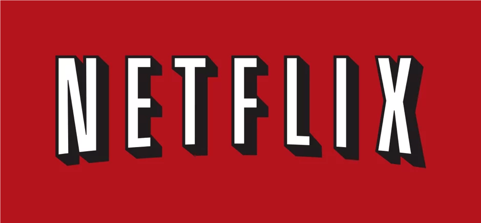
The company's second logo was a turning point. Netflix moved to a typographic logo set against a vivid red backdrop—akin to the red curtains found in traditional American theaters. Subtle details, like the curved letters resembling an old projector's output, added layers of nuance. This logo wasn't just a visual cue but a story encapsulating the essence of cinema and entertainment.

The Third Logo: Adapting to a New Generation
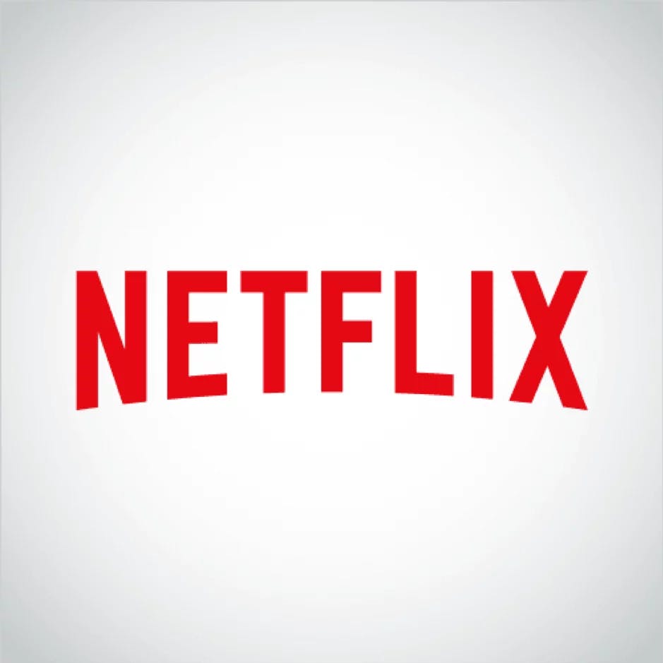
As Millennials became a dominant consumer force, Netflix streamlined its logo yet again. It retained the iconic arch and the red backdrop but discarded the 3D effects for a cleaner, more digital-friendly look. The design maintained its emotional resonance while adapting to a generation accustomed to instant gratification and quick access to data.
Conclusion: The Continuous Evolution
Netflix's brand has matured alongside its rapidly expanding content library and technological advancements. The way we consume media has dramatically shifted since the company's inception, and so has our interaction with brands. Netflix understands this and continues to evolve without losing sight of its original values.
In a digital age where content is king, Netflix has managed to build a brand that goes beyond its user interface. It is a testament to the power of robust branding, continually refining itself to stay relevant, adaptable, and resonant with audiences worldwide.
Whether you're seeking to refine your brand's message, improve its positioning, or are in need of a visual refresh, understanding the principles behind successful brand evolution, as exemplified by Netflix, The Uptown Agency can guide you in bringing your brand to life.


